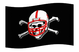
Not good, fellas...I'm not a graphic designer, but I know a couple and that leads me to say, the newest Kentucky Derby logo looks like crap.
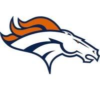
I think that's a horse there underneath the twin spires but I'm not quite sure. Kind of looks like the Broncos current logo, which, we all know, is far inferior to its predecessor. Look at that steam coming from the old bronco's nose! He was fired up.
This horse just looks futuristic and if there's one thing that isn't futuristic, it's the structure of a horse. Seeing this, it's hard to believe that I bought a hat featuring the 131st Kentucky Derby logo to commemorate my one and only (to date) trip to Louisville. That was good. Horse, rider, rose, twin spires.
Just about all you need.
Who is worse right now?...the Cards or the Yankees? Technically, the Cubs are worse than the Cardinals, but it hardly feels that way even after the Cubs pissed a win down their leg against the Pirates thanks to a cheap home run from Jason Bay.
Either way, I really couldn't be happier.
Need tickets?...And by that I don't mean I have a bunch to sell. Some good tips here for getting in to games anywhere except Boston. Not sure these would work in the Fens but even the Cubs seem to have ample ducats available right now.
Thank you, Scott, for the link. That's the first official tip here at HiPlainsDrifter.com, which is sort of a watershed moment. All the big blogs have official tip lines and while I'm hesitant to add that feature at this point, you can always reach me at brandonlvogel [at] gmail.com.
Book It!..Good friend, former competitor and better writer, Ty Hildenbrandt has posted his first piece for SIonCampus. Ty was the guy who beat me in the first Next Great Sportswriter competition over on FOXSports.com and we--we being those of you who read this blog and unyieldingly support HiPlainsDrifter.com-- hated him for that. Luckily, the second contest came around and I was able to realize he's a pretty good guy for a Yankee/Fighting Irish fan.
Check out his piece and then feel free to leave awe-inspired comments on his blog, QuickSlants.com.


1 comment:
BV --
Thanks for the kind words -- not sure about the better writer part, but I take it as a huge compliment.
As for that logo... if Martians were to land in the infield of Churchill Downs, I would expect the creatures that emerged from the spaceship to look something like the, um, "thing" depicted in that new logo. Never knew that horses had antennae...
Post a Comment