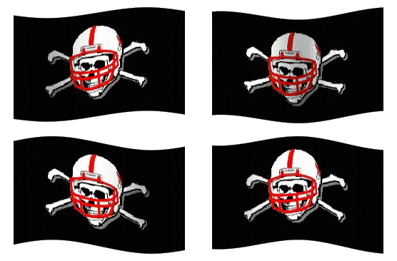
I have found, perhaps, the most false assertion ever made: Kansas State's helmets are preferable to Nebraska's. This opinion comes to you courtesy of Sporting News columnist Tom Dienhart. As offensive and erroneous as that may seem at face value it's actually far worse.
Dienhart isn't just saying that, given the choice at some Midwestern sporting goods store, he'd buy K-State's mini-helmet before he'd buy Nebraska's. He's saying that the Wildcats sport the best lid in the Big 12 while Nebraska dons the worst.
This is actually good for me as it saves me a lot of time trying to persuade you that I'm not attacking this stance from a Nebraska fan's point of view. I'd have to spend paragraphs explaining how I'd feel the same way even if I was an unbiased, national college football writer. It would take me literally hundreds of words to detail how I dislike K-State but don't hate them the way I hate people who double-park or the fact that I'll forever follow the Cubs or even other conference foes who have won more than 44% of the football games they've ever played.
--Exhibit A: It's purple, easily the worst color in the conference. If you need further explanation, please see http://www.uniwatchblog.com
--Exhibit B: The logo itself is simply the silhouette of a wildcat deconstructed. It doesn't spell or abbreviate anything and it's consistently outclassed by it's Wildcat brethren. But, really, it is the class of late 80's graphic design which leads me to...
--Exhibit C: There's just really not that much history here. K-State has only been wearing this design since 1989 which, I suppose, is a good starting point for the only era any Wildcat fan would care to remember but it pales in comparison to Texas (longhorn has been there since '60), A&M ('64) and even Texas Tech ('67). Oh, and Nebraska ('70).
Of course you might be saying that's simply my opinion but it's not; it's fact. It's as true an assessment as Dienhart's was false. I could conduct a highly scientific nationwide poll to prove this but what would be the point? I may as well ask the people if they'd rather eat crepes or crap; if they'd rather jump from a bridge and land in a barrel of cotton candy or a keg of nails. In both cases you'd get a few votes for the latter (freaks!), but nowhere near enough to validate the time it would take for me to poll each and every US citizen.
But now that I've set the record straight, I will give you some of my own much-coveted opinion. Here's how I would rank the aesthetic appeal of protective headgear in the Big 12:
- Texas -- The Longhorn logo is like the Jumpman Jordan for football only older.
- Texas A&M -- Classically styled.
- Nebraska -- See above.
- Colorado -- Simple, solid, gold. I think that's a good combination.
- Texas Tech -- Stacked T's look more modern than they actually are and those helmets really sparkle.
- Oklahoma -- Nice tradition but I've never loved the octagonal O.
- Baylor -- The Bears could come out wearing German war helmets with a spike on top and nobody would likely notice but what they do wear is actually pretty solid and it comes in assorted colors!
- Missouri -- The logo has changed throughout the years, but the helmet has always been black.
- Kansas -- It hurts that the Jayhawks can't decide on a design, but it helps that no matter what they use their in-state rival will always be worse.
- Oklahoma State -- Needless modernization of a pretty solid logo.
- Iowa State -- Pick any of your designs from before 1995 and just use that. Any one you like.
- Kansas State -- Where else?


No comments:
Post a Comment